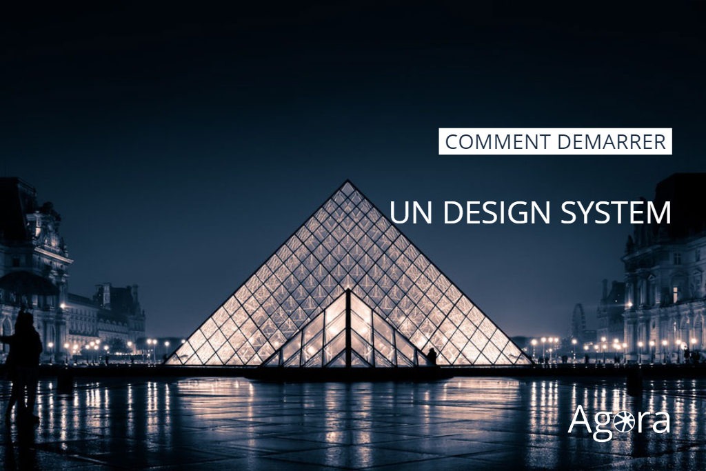
If you read last week announcement about Constellation, our Design System, we hope you are convinced of the worth of this initiative.
After ten years of continuously building our platform, we have one of the world’s most comprehensive and complex after-sales service management system, but the lack of coherence is showing. Clutter is prevalent throughout the interfaces and it disrupts the efficiency of our solutions
It’s time for us to refocus on a unifying idea to update an app that begins to look more like an old manor than a high tech villa.
This post details what led me to think about the new architecture of our interface, starting by the foundations. I must admit I wandered a lot and took often the wrong turn, before finding my way to our future home.
Asking for a Design System is easy, maybe trendy, certainly ambitious, but building it and launching the initiative is anything but obvious !
How to start?
I first looked into the most famous Design Systems like Material (Google), Carbon (IBM), Fluent (Microsoft), Polaris (Shopify)… Colors, typography, layout, navigation, icons, components, I felt ready to build our look & feel.
In fact, I was absorbed by the end result of these systems and I was missing the real revolution we were looking for : A design System is first and foremost a representation of our company’s values.
So, I started again, from scratch, but this time with our “Mission statement” as a starting point.
What is AGORA SAS mission ?
AGORA SAS is the service company that brings productivity gains throughout the entire after-sales chain in the consumer goods industry.
How does it translate for our users?
We offer quick and pragmatic solutions, from the sale of an appliance to its recycling.
Why do we need a Design System?
To materialize the core values of AGORA SAS in all our products and services.
How does it impact our Design System? Keeping in mind our mission statement helped us decide on 5 principles to guide our design : Consistency, Readability and Clarity, Speed, Relevance and Aesthetics.
Though these principles may seem obvious, they guided each of our decisions proves and proved extremely effective.
Principle 1 : Consistency
Throughout our services, our products, our communication, and our work processes, we must be consistent. Using our entire product line must feel familiar to all our users. There is a simple reason behind that logic: Our services touch many processes and even if most of our users use our applications on a daily basis, some services are rarely called. Whether for an little company or a multinational, a repairer or a manufacturer, everyone must feel confident to quickly take ownership of our solutions and not be afraid to discover news ones.
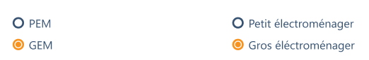
Each color has a meaning in Constellation, so that users are guided in their experience.
Principle 2 : Rapidity
The productivity of our customers is our priority, our “raison d’être”. To fulfill this commitment, we need to help them to focus on the essential and perform their tasks as efficiently as possible.
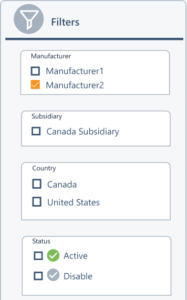
Filters make it easy to access your data.
Principle 3 : Relevance
We connect all the stakeholders of the after-sales service. As a result, an incredible flow of events and actions pass between our different services and products. To be effective, it is vital to provide a contextual interface relevant to the actions of our users. Our interface must provide the right information at the right time, no matter where and how our users work, no matter what tools they have and what devices they use.
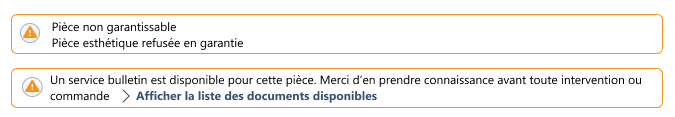
Relevant information is transmitted when a repairer orders a sensitive spare part for an intervention.
Principle 4 : Readability and Clarity
Do you know the difference between Readability and Clarity? Far from simple, this led to many debates in the team.
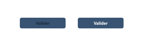
Information can be clear but unreadable, for example if the contrast is not sufficient.
On the first button, the contrast ratio between background and text is 1.81 according to WCAG 2.0, while it’s 7.8 on the second button. The minimum acceptable is 3.
Information may be readable but unclear, for example if too many acronyms are used.
Do you know the FLDSMDFR? Even if the sentence "Flint Lockwood Diatonic Super Mutating Dynamic Food Replicator" is long, it's clearer than its acronym !
Our ambition is to be both clear and readable. Our interface must be self evident and yet concise for all of our users, focusing only on the main points, without visual or interactive noise. It must not be decorative.
Principle 5: Aesthetics
We believe that working with an aesthetic interface improves productivity. What we call “beauty”, is a refined vision of aesthetics, pleasant and soothing. It is an extension of the principles of Kaizen, applied to the graphical interface.
When you enter a pleasant office, you are unconsciously comfortable, ready to be productive. Conversely, in an harsh environment, you feel stressed and the degraded work conditions reduce your productivity.
There is a lot to say about the link between productivity and the environment, I will come back to this in a future article…
To conclude
We believe that by using those five principles, our users will focus on their work. Unfortunately, they will probably not be aware of all the efforts behind Constellation … I will present in late post other aspects of Constellation, which might go unnoticed. I hope you will be surprised!